Some people like music for the music, and some people like music for the tiny square of art that appears in the bottom left corner of Spotify. This is the post for those people.
Tradition - Monsune

Let’s start off with a classic on this blog, we’ve ranted about this album cover before (so maybe just read all of our blogs you know?) but Monsune is an audiovisual genius, and this self-designed cover of his EP Tradition proves it. In fact, all of this man’s aesthetics ARE SO DAMN GOOD, not just his art.


BO Y - Deaton Chris Anthony

Deaton Chris Anthony’s album art for BO Y is really really fucking good. It also perfectly matches the vibe of his music (all over the place lol). The fake NBA logo in the bottom right is such an iconic move.
Discovery, Half-Light - Rostam
Rostam, as you should know by now, is a genius, so obviously his album art is top-notch.
The Discovery LP album art is just a square color palette, but not everything needs to be complicated to be beautiful. The colors are swatched into smaller and smaller squares, but still maintain this clean-cut, gridlike feeling. The colors are fun and fresh and make me feel young again, like summertime and riding public transport to journal in the park is something that I do.


Half-Light— the streams of colors in his hair, his beautiful face, and “Rostam” printed in Farsi crystal-clear over the deliberate pixelization of the image — it’s, as the kids say, an aesthetic.
MAGDALENE - FKA Twigs
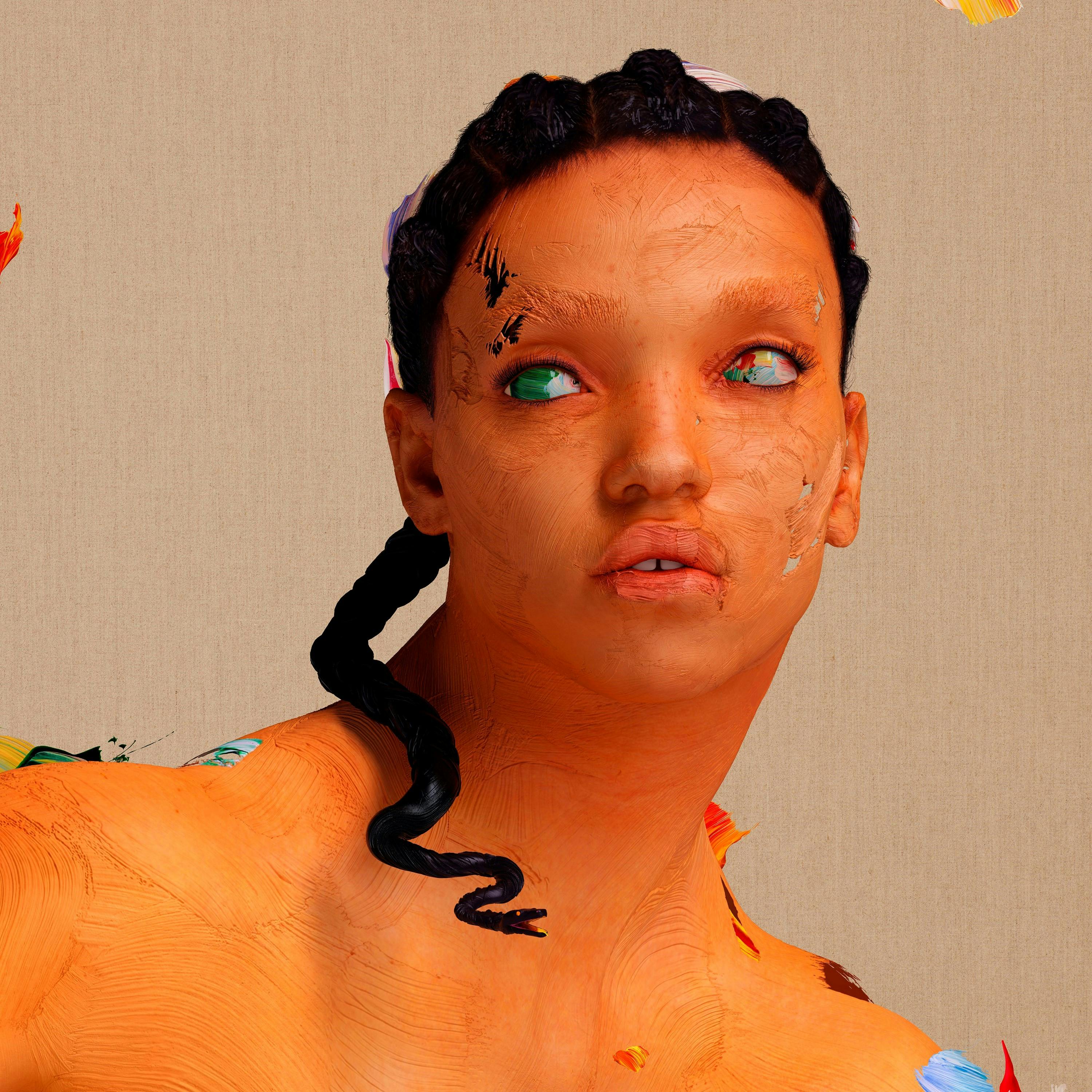
FKA Twigs has trippy, borderline scary album art that’s still a fucking trip to look at. And the way you can see the paintstrokes that form the body, the way it feels like a sculpture—there’s just so much texture in it and it’s lovely.
channel ORANGE - Frank Ocean

Is the album art for channel ORANGE just an orange square with “channel ORANGE” written on it? Yeah. Is it still perfect? Of course it is. I think the simplicity of the cover art is what made it so iconic. It’s exactly what it is, you know — channel ORANGE, with a little bit of radio static. ALSO, the hidden meaning of “channel ORANGE”, of the color of the album and of the name is touching. The man gets young love right:
Orange is the color of liberation, from the pains of hurtful love and inner insecurities. To “channel orange” is to truly be free, to be you.
Also if you haven’t read his letter accompanying the album, go read it.
The Life of Pablo - Kanye West
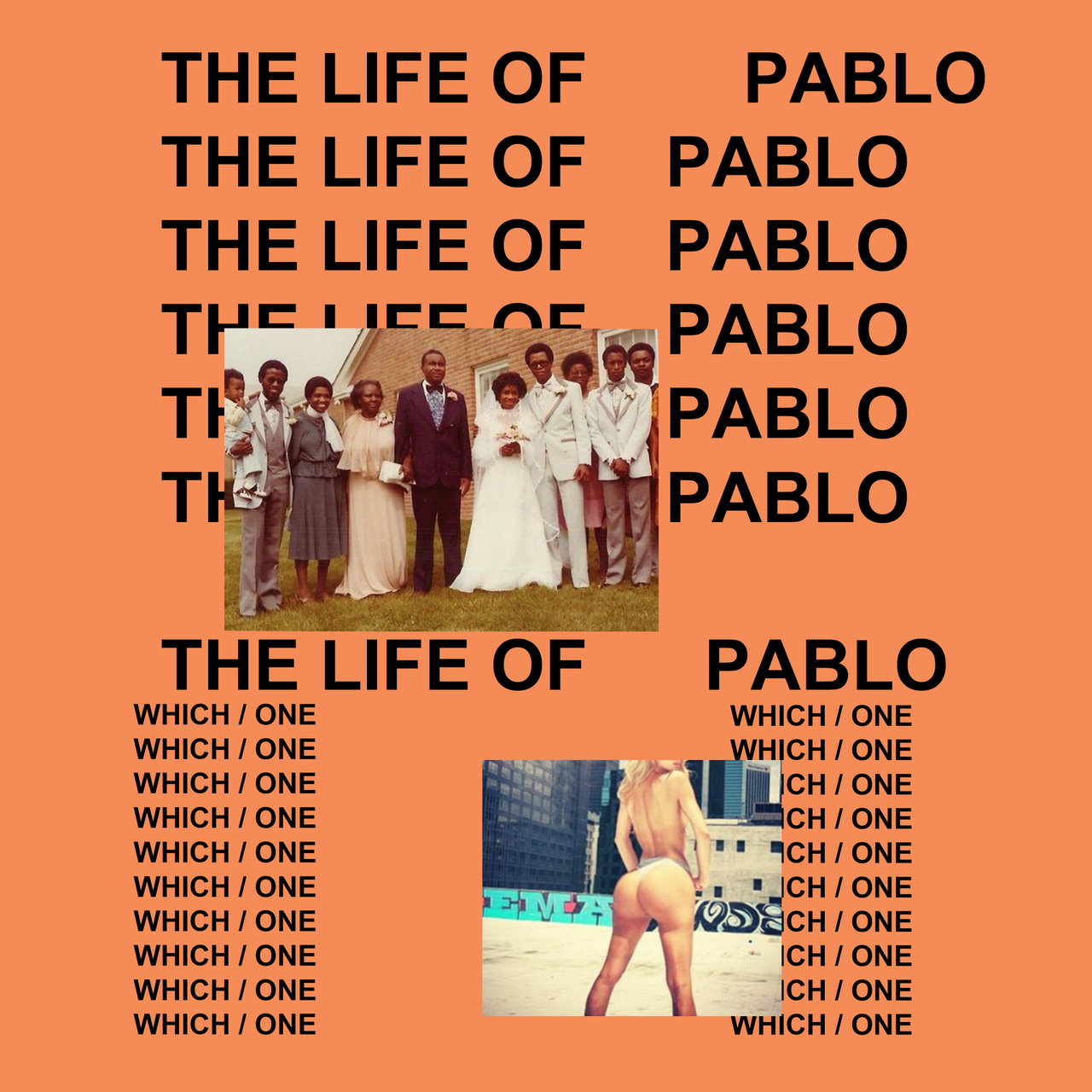
Self-explanatory.
I Love You, Honeybear - Father John Misty
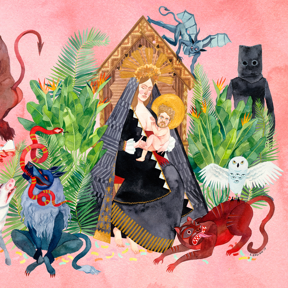
This has less to do with his geniosity and more to do with the fact that he used a really cool artist to make custom illustrations and artwork.


Drunk - Thundercat
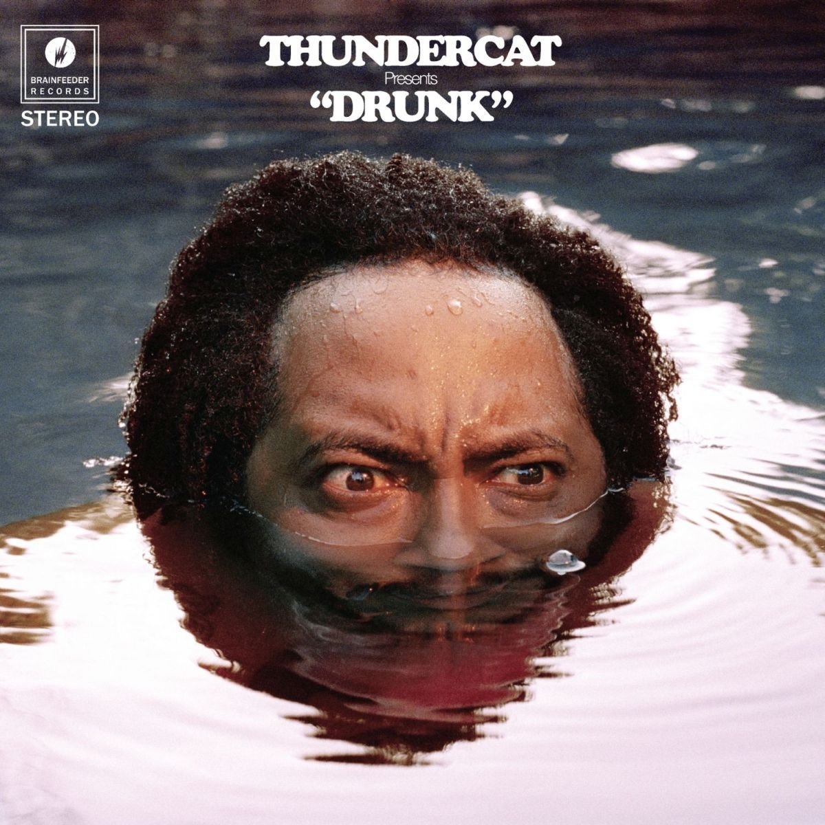
Honestly, one of the best album covers I’ve seen. It accurately portrays the, for lack of better words, “mellow anger” Thundercat hits us with on this album.
22, A Million — Bon Iver

The Age of Adz - Sufjan Stevens

Some albums that are less about the artistry and more about the vibe:
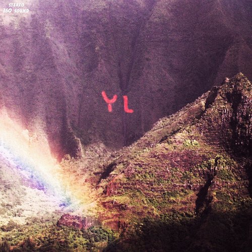
Youth Lagoon’s The Year of Hibernation
Modern Vampires of the City

WWW.


